
Two things that worry me about Creo 1.0
PTC has made major improvements with Creo 1.0 in comparison to Pro/ENGINEER Wildfire 5. I refuse to call it Creo Elements/Pro 5. because it's confusing many people.
I enjoy what I see so far in Creo 1.0 and I have 3 of my users beta testing it internally. I am not ready to officially deploy Creo 1.0 but I find a lot of value in testing it internally.
Two things that bother me about Creo 1.0
1. Get rid of the old "Menu Manager"
One of the most frustrating things about Wildfire is that the UI was NEVER completed. PTC showed us a new direction for Pro/ENGINEER with Wildfire 1.0 but never delivered a completed UI. We are currently running Wildfire 5 and the UI is still not completed and never will be since Creo is the what PTC will be selling going forward. Wildfire was difficult to teach new users because I had to constantly explain to them why there are two different User Interfaces in the software. They worked very different from each other, so it felt like you were using two different CAD systems. The worst part was that Wildfire has certain features and the old Pro/E 2001 Menu Manager had other features.
Wildfire was a complete mess and something PTC should try despreatly to prevent in the future.
Creo 1.0 is a new begining for PTC. A chance to show the world that PTC is once again an innovator in the CAD space and that Creo is going to provide a new and unique experience for the CAD industry.
Guess what. Creo 1.0 still have many features that require the old "Menu Manager" from 25 years ago. The experience using Creo is tarnished by this old code and old UI. If Creo is supposed to be something new from PTC, why does it have the old "Menu Manager" all over the place?
I hope PTC is paying attention here and I hope they don't damage the Creo experience by repeating the same mistakes from Wildfire.
REMOVE THE MENU MANAGER. If I am going to pay good money for the next generation CAD experience, it better not have a mixture of UI's.
2. Take pride in your UI
Creo 1.0 looks different, it looks refreshing and it looks horrible. PTC released Creo 1.0 with icons that look like a 3 year old created them. Very low res, very cheap looking icons on their next generation CAD software.
I don't know how something like this got the thumbs up for release because it sends a very bad message to the consumer. To me, this says that Creo is being rushed, it's not complete and would probably never be completed because of my experience with Wildfire.
With Creo 2.0, PTC should take the resources needed to overhaul the icons on their UI. It's amazing that I am asking for this on a newly released next generation CAD system, but it's too late. PTC already missed the oppourtunity with Creo 1.0 but at least try to fix the mistake with Creo 2.0
Those who are testing or using Creo 1.0 know what I am talking about. You have seen the terrible icons that are found all over the UI. Does this seem like a new and improved product to you?
For those of you who have not yet installed Creo 1.0 to see what I am talking about. Look at the images below. You tell me if this looks and feels like a next generation CAD system that PTC is proud of releasing?
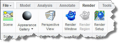
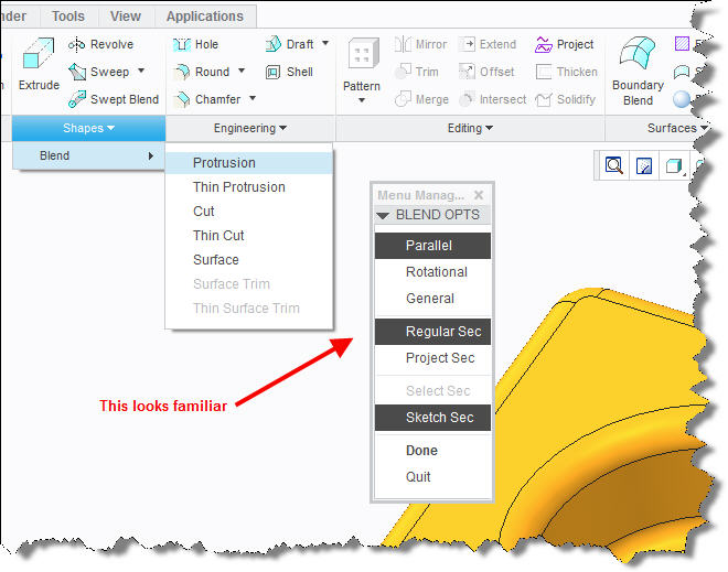
Many people call me a big PTC cheerleader, but I am also one of their biggest critics. I built my career around PTC's software and I belive it's one of the most powerful CAD systems in the market. Wildfire left me thinking that PTC is no longer in the CAD business and Creo is starting to change my mind about it. This is PTC's chance to change everyone's mind on their vision for CAD, so every little mistake means a lot. Releasing Creo 1.0 with the Menu Manager still lurking in the background and with icons that look like they belong to an Atari 2600 game was a mistake in my opinion.
This is your chance to shine PTC. Don't blow it.