
Jul 14, 2016 2:21 PM UTC
Question

Menu manager, really?

Hi there,

First of all, I really like the improvements of Creo 4.

I guess You hear the "but" coming.

But.

With the introduction of Wildfire 1.0 PTC started to revamp its GUI to a much more user friendly experience. But the old menu manager was still present. "Does not matter", I thought. "They will fix this with WF2 at the latest". When WF2 came out, menu manager was still there. But I was sure they will fix all of it with WF3. And so on.

With the ninth major Version after Pro/Engineer 2001, menu manager is still present.
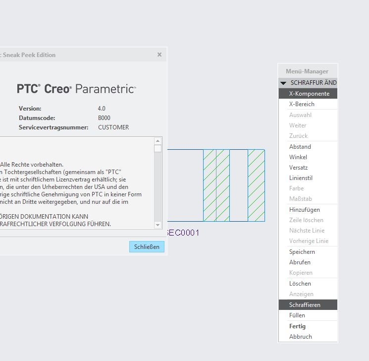
menumanager_creo4.JPG

Maybe menu manager is like many things from the 90's You cannot get rid of. Like bike shorts, CK1 or The BackStreet Boys' "Everybody".

But I am sure You will Fix it with Creo 4.0 F000 

Cheers

Matthias

2 replies

Jul 15, 2016 12:39 PM UTC

I haven't been using ProE/Creo as long as you, but still cannot believe the terrible blend of the old and the new that this software has. It makes it painful to use at times. I just REALLY want Creo to solve some of their inconsistencies (ie. middle click exits the dimensioning feature, but starts a new note - forcing  you to actually hit DONE to exit the note command.) A consistent program is easy to learn and work with. We unfortunately still have some product lines in 2D, so it isn't unusual for some designers to go a month or two without using Creo. It is almost like starting over every time they come back to it.

3-Newcomer
Jul 15, 2016 1:54 PM UTC

I hear you, it's been a long running issue with PTC products. Believe it or not, Creo 3 is probably the most consistent UI that Creo / Proe has had in a long time. 

Back in the early releases, it was all the menu manager. Generally very consistent (done / done return / done select / done ret / done sel not withstanding), but generally very painful to use. 

Starting in release 20, we started getting icons.  From there to Creo 1 it was a hodge podge of menus, toolbars, icons and the menu manager.  Creo 1 was the biggest UI overhaul in some time and brought much more consistency, and it's gotten more so over time. 

That's not to say that the new UI isn't without problems, but it is more consistent.

BTW, you may want to vote on this idea

Consistent Behavior for Middle Mouse Button