
GUI Quirks
It is really looking like in Creo 4 the user experience and the GUI is better - but continuous improvement should never stop. So I am hoping you can go after the low hanging fruit before you release this software in November:
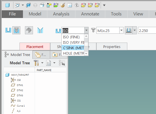
A) The width of many dialogs is still simply too narrow. Take a look at the list of hole tables:
In this age of 21" wide monitors as a minimum, why have so much white-space in the dashboard?
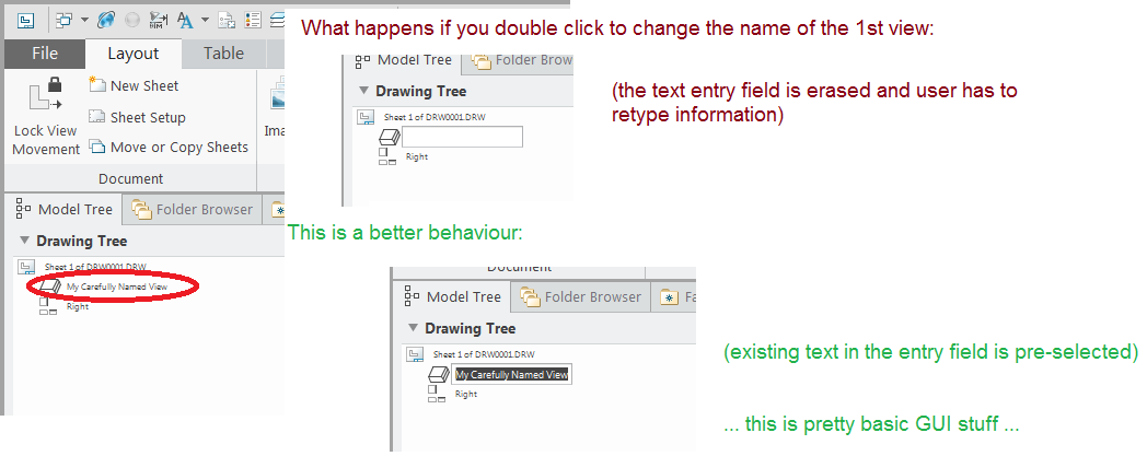
B) Little things like renaming a drawing view are still a bother:
C) Another little nag - why can't I reorder the Views shown in the drawing tree?
D) The new full screen mode is great. Be aware, though, that F11 key is still available to be used for mapkeys - in which case the user will note be able to use F11 to leave the full screen mode because their mapkey will execute instead.
PTC personnel, please indicate if you are open to sneak-peek users reporting such "bugs" on this forum.