
May 16, 2012 11:22 AM UTC
Clarification Needed

Wireframe font named “font” is too segmented.

Related products:Creo Parametric

Wireframe font named “font” is too segmented. We need a smooth font with a minimum of entities.

A better Pro/E or Creo font should be created or the original Pro/E “font” modified.

Non-linear entities should be defined as arcs, ellipses or splines as illustrated.

An enhanced wireframe font would improve the quality and the time of CAM engraving tool paths.
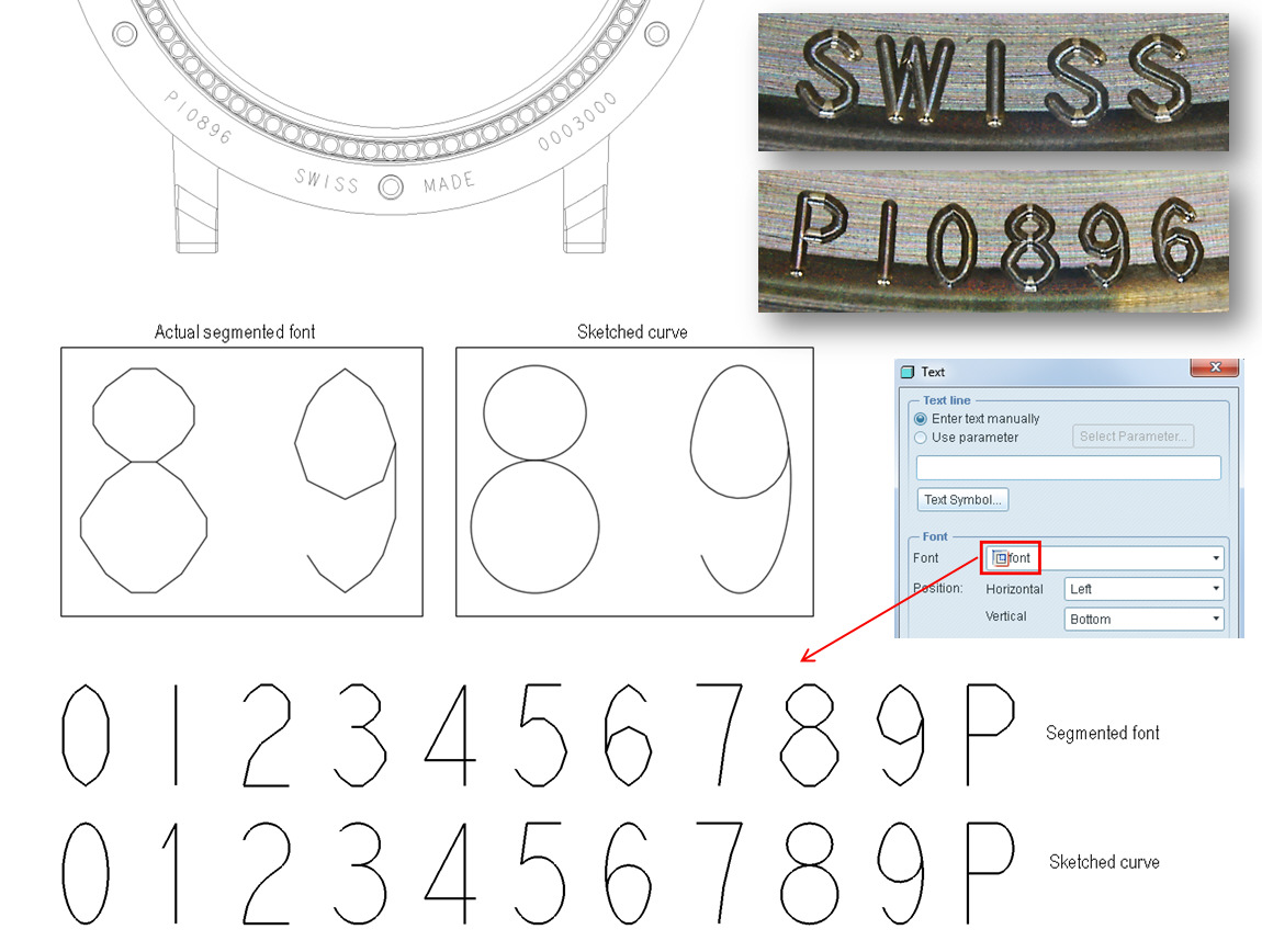
font segmented.jpg

3 replies

May 28, 2015 8:18 PM UTC

A similar but different idea is for the "1" so it doesn't look like a lower case "L" -> "l".

The Number "1"

Jun 14, 2018 6:33 PM UTC
Status changed to: Acknowledged
Jun 28, 2020 3:22 PM UTC
Status changed to: Clarification Needed

Hi @NicolasBourgeoi1 ,

We have introduced new default fonts with Creo 4.0. Now the default font is Arial WGL and it is not segmented as the "font" font

Does this font achieves the requirements from your POV?