
Jan 17, 2017 11:37 PM UTC
Archived

Print Preview window text colors are hard to read using Default Colors

Related products:Creo Parametric

Using the default colors:

If the Print preview window is open, the text on the bottom of the screen which lists the scale / size... is a similar color as the background. This is hard to read and should be fixed.
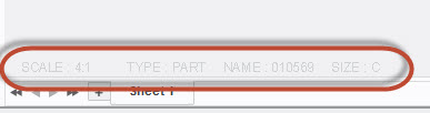
text.jpg

4 replies

Jan 18, 2017 1:56 AM UTC

The contrast does seem to be lacking.  Here is a comparison of how the text looks using the three different themes:

Just to be clear, this is Creo Parametric 4.0.

jwaghAuthor
Jan 18, 2017 2:04 AM UTC

Good job. I think all 3 in the Drawing column are OK. All 3 Print Previews are lacking.

Jan 18, 2017 8:07 PM UTC

By the way, the color of this text is controlled by the Secondary highlight system color.

The shift that occurs to both the background color and the secondary highlight color during print preview seems to be hardcoded.

olivierlp
Community Manager
Jan 4, 2022 3:11 PM UTC
Status changed to: Archived

Hello,

We are archiving your idea as part of a general review. This action is based on the age of your idea and the total number of votes received, as per this announcement.

You can always post a new idea with all the details required in the form.

Thank you for your participation.

Olivier