
Dialog Interface - facelift needed
We (users) are having real problems with dialogs not being adjustable. This is problematic in many places where relevant data is truncated and there is no way to adjust the dialog to compensate.
One example has been issues with the Creo 2.0 Appearance Manager but this is only 1 of many dialogs that behave this way.
We need to have dialogs be more flexible with user intervention rather than these arbitrary locks.
This example shows how the software can adjust itself, but not by users:
This is the locked datum plane dialog:
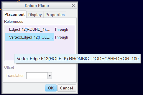
Using the relation/parameter dialog causes these really obscure locks and drag methods. Nothing intuitive about it but the persistent user will find how to manipulate this.
Is there really a reason not to move UI dialog windows to the 21st century?