
Creo error icon in Message Area is not intuitive and doesn't match the rest of Creo
1. Describe the Problem
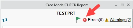
The message area of Creo uses a strange blue icon to indicate an error. Users often doesn't understand this icon to be an error and that it is more important the yellow warning icon.

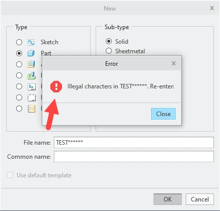
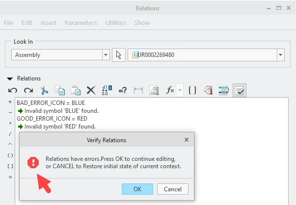
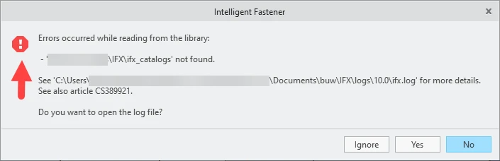
This does not match the more intuitive red error icons used elsewhere in Creo.
Error message in New Part:
Relations menu error:
Here's an error message from IFX:
If PTC changes the blue icon to the more intuitive red error icon, PTC will probably also want to review what's actually marked as as error in the message area and switch to a warning or info message if needed.
2. Are you using a workaround?
Users ignore errors or have to be trained to understand the blue icon in the Message Area.
3. What is the use case for your organization?
More intuitive error icon for Creo. Users more likely to pay attention to error and understand that it's more important than a warning.
4. What impact does this problem currently have on your organization?
Users often ignore errors or don't realize the the message is an error. This occurs in out of the box Creo or when creating custom Creo Toolkit applications.